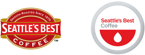
 Interesting rebranding for Seattle's Best Coffee. I have noticed that many companies are desiring to give a more clean, simple look to their products packaging or product logos, but does it get to a point that it becomes generic looking? Only time will tell on this new logo. Read a full article about people's thoughts on this change here!

Showing posts with label my babble on design. Show all posts
Showing posts with label my babble on design. Show all posts
5.19.2010
Interesting Logo Rebranding
Interesting rebranding for Seattle's Best Coffee. I have noticed that many companies are desiring to give a more clean, simple look to their products packaging or product logos, but does it get to a point that it becomes generic looking? Only time will tell on this new logo. Read a full article about people's thoughts on this change here!
5.14.2010
Octopus on Carnaby Street in London
 I've been waiting for months for, Octopus, this absolutely fun shop to put up their website. I accidentally came across them as I was perusing the streets of London last October. From one look at their pink store front and super fun name I was sold, and just had to go in. I bought this fun backpack for my 2 year old daughter. It is way cute!
 I also have fallen in love with their logo. It is so simple, fun and I must give the designer, whomever they may be, props.
Anyways, I'm so excited that I now can view their items online instead of having to rely on my memory of the bright and colorful nick-knacks they sell from my stroll that day.
8.07.2009
Shipping Box Turns Into a Hanger
 This awesome award winning package design is called the Hangerpak by new designer Steve Haslip. It also comes in a variety of colors. It's like magic, first a shipping box then a hanger. Genious!
8.05.2009
Creative Farm YouTube Video

Thanks to my friend Allison M. I was exposed to this crazy, silly video on harvesting creative juices. It's a must see for any creative! View it here at YouTube.com.
7.29.2009
Another Great Cross Logo

I absolutely love finding cross logos. Why? Well because I love seeing designers interpretations. Often I think that there is nothing new that can be done with the cross. Well designers keep amazing me as I keep seeing new cross logos.
This logo is a Christian Graphic Designers logo named sartidesign. Love their work and love what they are doing to further God's Kingdom for churches in the Graphic Arts.
7.20.2009
Room Colors and Mood
 So I was relaxing in my new bedroom, of a couple months, and was enjoying the cool blues my husband and I decided to paint it. Then of course my design brain kicked in and began thinking about the mood of colors and thought, "blues really do relax you"!
So then I just had to pull out this color mood chart that I remembered finding in a book I checked out from the library once. The book is called, The Busy Woman's Home Spa Book by Liz Wilde.
So then the crazy side in me popped out and I took the chart and ran around my house to see if the colors in that room really matched up to what I was feeling when I was in that room. It sure did! Or at least I thought it did. Well...it sure was fun and made me really learn a lot about myself.
Here is the color mood chart if want to test your house!
BLUE
It calms nerves, relaxes and quiets your mind and helps insomnia and depression.
RED
Raises body temperature, stimulates mental energy and helps aches, pains & poor circulation.
YELLOW
Encourages optimism, boosts confidence and helps depression and digestive problems.
ORANGE
Inspires joy, eases loneliness and helps lethargy and detoxing.
GREEN
Aids meditation, eases anger and frustration and helps exhaustion and headaches.
INDIGO
Stimulates imagination, promotes optimism and helps weak immune systems and negativity.
6.28.2009
Fun Inspiration


Today is one of those days that I wanted to have some smiles and fun inspiration. So I headed on over to Share Some Candy where I took some time checking out the pics under the handcrafted section and got a few good laughs, smiles, and inspiration. These pics above are two of my favorite ideas!
6.12.2009
2009 Logo Trends at Logo Lounge
I was reading Logo Lounge's article { here } on the 2009 Logo trends and found one rather interesting trend, the doily.
I've never liked doily's myself and have always had to hold back when I see those paper ones at parties, but for some reason these doily designed logos look really fantastic. Maybe you really can make doily's look cool!
6.08.2009
Cardboard Office


I was reading my May 2009 GD USA magazine and came across this article about this Amsterdam ad agency with the name Nothing that created their office all out of cardboard. I was of course very intrigued by this concept and took a spin on their website { here } to see more pictures.
At first I loved the idea...and then the more I thought about it, I thought about what it would really be like to have a cardboard desk, shelves, table, etc. I don't know about others, but it would drive me absolutely crazy. The tears, the scratches, the eventual worn look. In about a year I wondered if the cardboard would be all tattered looking and difficult and dirty because of the difficulty in cleaning it. Anyways, it is an interesting concept that's for sure!
5.29.2009
Pantone Color Forcast & Facebook Moods
So my May issue of GD USA came in the mail today and fell in love with the cover. Lots of colorful vintage shoes! The Pantone Annual Color Forecast was published in this issue and so I happily enjoyed checking it out. Here is a sneak peak at a few of the colors for fall 2009.
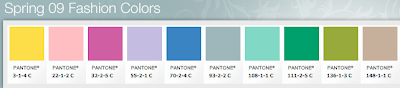 Of course bright, fun, a bit of 80's and some vintage in there too. Then I ran across how I could post my color mood on Facebook. Signed up right away as anything having to do with color is a must! However, I can't seem to get it to post to my profile even though I followed the instructions they published in GD USA. Oh well, I'll keep checking back with it anyways as I think it is a fun application.
So if your interested in displaying color moods on your Profile page in Facebook, here's the instructions from Pantone themselves:
1. Download PANTONE Moods application by going to http://www.facebook.com/home.ph#/apps/application.php?id+36410659303&ref=ts
2. Then go to Settings/Application Settings/ Pantone Edit Settings
3. Select "Allow Pantone to publish specific story sies automatically without prompting"
4. Select "Short" or "Full" (depending on what options are available)
5.27.2009
Great Magazine Layouts & Designs


I've never been a huge fan of purchasing magazines, except when it comes to a few design magazines. But earlier this year I had the opportunity to sign up for a year's free subscription on several magazines. How you might ask? Well, I follow a couple of blogs, Money Saving Mom and It's Hip 2 Save that highlighted the magazine deals and so I decided to take advantage of the offers.
Anyways, the reason I'm not a huge fan of non-design magazines (besides the extra cost) is that I honestly don't like many layouts. I've always found them way too busy, (like Women's Day for instance which has a yucky design), way too many ads that are poorly placed and poorly designed, color schemes that don't go together at all and layouts that look more like they belong in the classifieds.
Well to my surprise I have found some absolutely fantastic layouts from my free magazines and honestly look forward to getting them in the mail to read and drool over the designs, colors and articles. My top favorite non-design magazines so far that I receive are:
1. Martha Stewart Living
2. Body + Soul (A Martha Stewart Publication)
3. Kiwi
designed by: May Media Group
4. Real Simple
5. Sprouts Farmers Market (my local grocery store's magazine)
designed by: Penton Custom Media
I think my next trip to the store will be a scavenger hunt in the magazine section for more great layouts.
5.16.2009
The Library for Design Books
Recently I have gotten addicted to my local library. I used to spend my days at Borders or Barnes and Noble searching the Art & Design section, sitting down, relaxing and flipping through every design book I could get my hands on......and then eventually would spend a ton of money.
Well, I now have a toddler and so those days are few and far between. I go to the Library with my daughter every week for Storytime and now enjoy searching through their Art & Design section. Of course you can't always find the most recent releases and the design section is pretty small, but you'd be surprised at the great books that they do have. I've found a ton of great treasures.
My most recent 3 library surprises were: (I have them linked to Amazon so you can find more info on them.)
1 :: Noah's Ark by Rien Poortvliet

2 :: Mediapedia: Creative Tools and Techniques by Kit Laybourne

3 :: Praying in Color: Drawing a New Path to God by Sybil MacBeth

Well, I now have a toddler and so those days are few and far between. I go to the Library with my daughter every week for Storytime and now enjoy searching through their Art & Design section. Of course you can't always find the most recent releases and the design section is pretty small, but you'd be surprised at the great books that they do have. I've found a ton of great treasures.
My most recent 3 library surprises were: (I have them linked to Amazon so you can find more info on them.)
1 :: Noah's Ark by Rien Poortvliet

2 :: Mediapedia: Creative Tools and Techniques by Kit Laybourne
3 :: Praying in Color: Drawing a New Path to God by Sybil MacBeth

4.12.2009
The Cross
 Today being Easter I wanted to highlight the cross. It's amazing how many different ways you can design the cross and even color the cross. Of course the cross didn't start out as a symbol but much more than that. However, a symbol is what remains in order to remind us of Christ dying to save us from our sins. It is in my mind the most amazing symbol there is. It is amazing that one symbol is the most recognized, the most talked about, the most not talked about, the most meaningful, the most controversial and the one most used.
I often worry when I've been asked again and again to create a cross in a design, that I won't be able to come up with something original; but yet I always do. Of course the base design isn't original, but how that cross is portrayed is. And it's now become fun for me to see how many new ways I can portray a cross.
If you go to one of my favorite stock photo sites, istockphoto.com, you can see some great cross designs and get some inspiration for your next attempt at a cross.
4.09.2009
Pantone or Crayola?
I also love going to Crayola.com as there is so much fun stuff there like America's Top 50 colors. Check that out here. It's a fun place to be a kid again and find out fun facts. And even get color inspiration for your next project. Happy coloring!
4.04.2009
Logo Highlights

Here at Smashing Magazine there are logos for inspiration. It showcases some of the new design trends and is a great place to get some ideas. Simplistic designs are still the way to go and lots and lots of color. An array of rainbow colors, purples and blues, love it! There are some nicely done logos and some interesting ones. Check them out and see what you think.
3.26.2009
History of Logos
Ok...I'm done drooling over The Jeep logo...check out your favorite here. Oh, and Logo Orange also highlights a great must read article about 2009 logo design trends, check it out!
1.19.2009
Church Logos
Logo design has become a specialty and a love of mine. I have to laugh because I didn't plan on it, it just happened. As I look back at my logo designs I realized that the majority of them have been for churches. So because of this, I have a special place in my heart for the desire to make sure that churches have great logos and a great start in branding as it really saves a lot of time and stress later on.
So with that, I am constantly keeping my eye out as I drive around or search the internet for a decent church logo (as it can be hard to find). Here are some great church logos that I have stumbled on and wanted to highlight. Of course I haven't even scratched the surface of all the millions of churches out there and so I will from time to time post more great logos as I find them.


So with that, I am constantly keeping my eye out as I drive around or search the internet for a decent church logo (as it can be hard to find). Here are some great church logos that I have stumbled on and wanted to highlight. Of course I haven't even scratched the surface of all the millions of churches out there and so I will from time to time post more great logos as I find them.


10.07.2008
Simple Sites
I find it interesting that web designers have simplified the design of websites more and more each year. Little by little we are finally realizing that designs can truly be "too busy". I just created my new website and after doing much research I found such simplistic sites and couldn't believe that I also was desiring something with as little information as possible.
This sure tells me that even though us humans like technology and constantly having something "new", there does come a point where we all just can't take it all in. I know that I desire a simplistic look in my own designing. Very clean, easy on the eyes, a peaceful design.
I feel that the current design trend is tranquil art. Art that can cause you to sit back and take a deep breath and daydream about your favorite spot to retreat. I like this trend. I wonder how long it will last. Will we stay simple for decades or will it become busy again?
Subscribe to:
Posts (Atom)